Project goal
Design a “Millennial-friendly” online property insurance quoting experience to generate new leads.
My role
I was the sole designer on this project. I worked with a developer, a researcher, and subject matter experts.
Outcome
The tool was live through 2020 and brought in 5 figures of new policy sales revenue.
When I joined MAPFRE, there was no way for a potential customer to get a property insurance quote online. The only online option was for auto insurance quotes, and it was difficult for users to figure out how they could get property insurance. Worse yet, most other major insurance companies already had well-established online quoting processes. Combined with the fact that my fellow Millennials stereotypically dislike making phone calls and prefer to do tasks like this over the Internet when possible, the lack of an online option presented a problem for MAPFRE.
Defining the problem
MAPFRE was missing out on opportunities to generate more potential customers. Although they offer numerous types of insurance, the only online quote offered as of Spring 2019 was the auto insurance quote. Not only was it impossible to get online quotes for the other lines of business, but it was also difficult to find the appropriate phone numbers to call to get these quotes. They were not listed anywhere on the MAPFRE USA website.
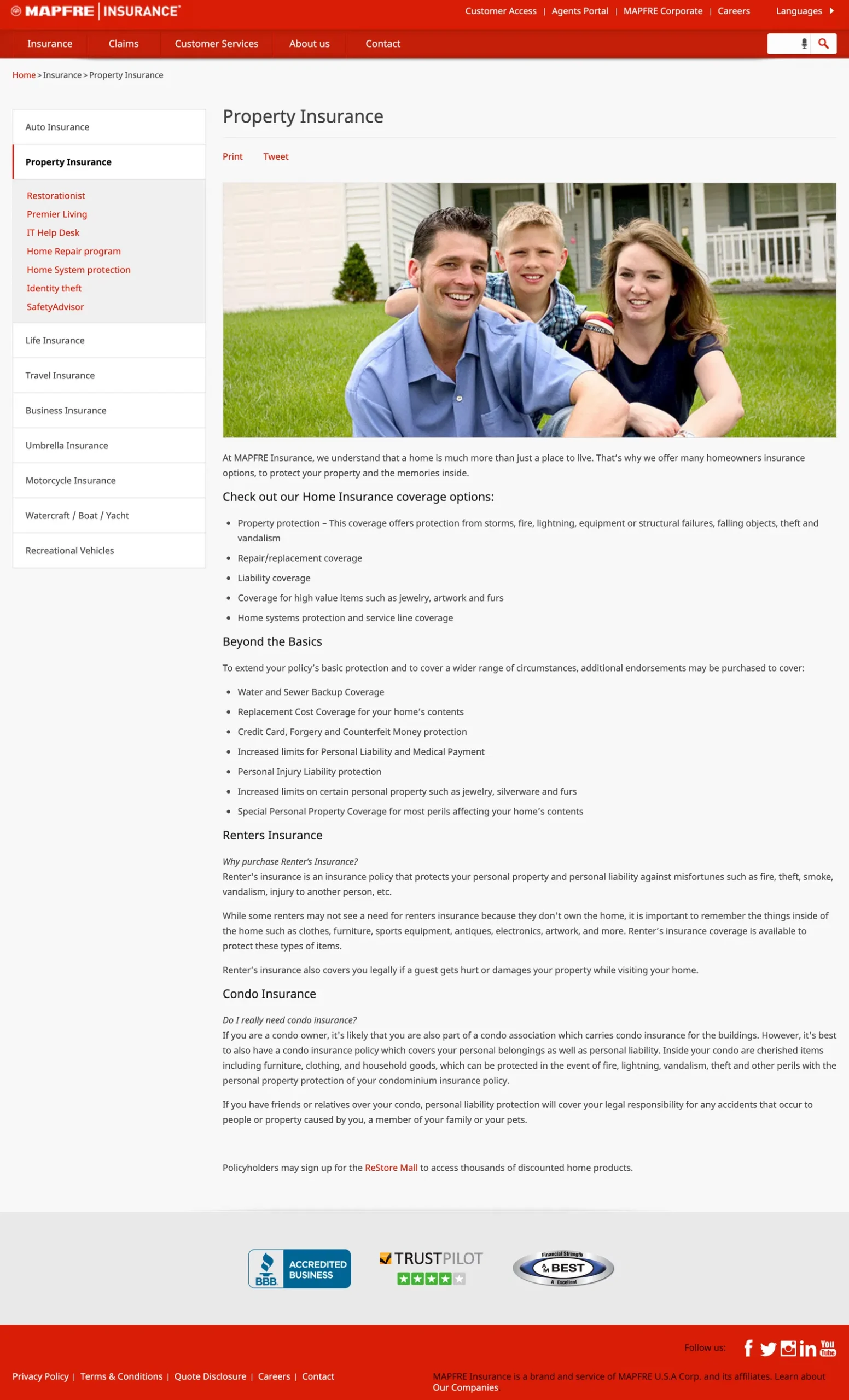
The property insurance page on the site, pictured below as it was before the implementation of this project, offered a lot of information about the product but failed to inform potential customers how they could go about getting a quote. There was no call to action or phone number listed anywhere on the page.
The complete lack of an online option was also a hurdle for potential customers. Without the ability to fill in the relevant information about their home or apartment online, potential customers instead had to call during business hours and answer the list of questions over the phone. This could be inconvenient for people who might be at work during those hours, or are otherwise pressed for time.
Analyzing competitors
I took a look at competitors’ property insurance quoting experiences. My team and I quickly discovered that almost any insurance company you could think of off the top of your head already had online options. I went through each company’s process to get an idea of what questions were asked and how the experience differed for renters and homeowners.
Key insights:
- Some companies offered users assistance with filling out the quote forms, for example by integrating with Zillow to pull data about the property.
- Most companies offered online binding, which was unfortunately not possible for MAPFRE at the time.
- The basic structure of the form was almost always the same.
Choosing a conversational UI
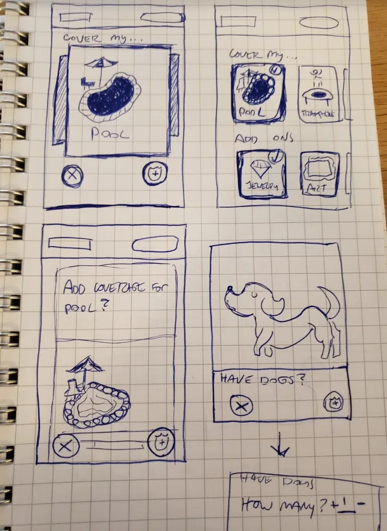
Even as a Millennial myself, I struggled with the concept of a “Millennial-friendly” property insurance quoting tool. I assumed that this either meant something very modern, or something based on the apps most closely associated with my age group.
I had a bit of fun brainstorming some possible candidates. Here is a “Tinder for insurance” concept that didn’t quite make the cut!
In the end, my team and I ended up choosing a conversational UI. There are solid reasons why conversational UIs have exploded in popularity. They have higher conversion rates than traditional forms and provide a solid foundation for expanding into voice UI territory. As interacting with voice-based assistants like Amazon’s Alexa becomes more common, MAPFRE may discover the need to explore this route in the future.
Accessibility was another reason my team and I chose this UI style. Conversational UIs are good for sight-impaired users because they can be translated so easily into voice, and they pair well with screen readers. By focusing much of the experience on the questions being asked instead of on fancy graphics, we could deliver the best possible experience to this group.
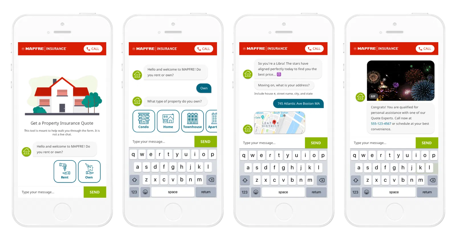
We decided to keep the visuals of our conversational form similar to a standard chat screen because people are already used to this paradigm. Our developer found a plugin that styled any regular form like a conversation, as if users were messaging with a chatbot. The pseudo-chatbot’s responses would go on the left, user’s responses on the right, and the keyboard at the bottom. To edit an answer, users would tap the chat bubble containing whichever thing they wanted to change.
Writing the content
Business experts provided a full list of questions that MAPFRE asks potential customers over the phone for the three types of property policies: home, condo, and renter’s. Not all of the questions were necessary for simple lead generation. To keep users from becoming frustrated with the length of the process, I worked with our experts to whittle down the list to only the essentials. This ultimately amounted to contact information and knockout questions.
I also thought about more ways we could make the experience seem fresh and modern. After all, the insurance industry has an old-fashioned reputation, and I was specifically asked to appeal to my fellow Millennials. The implementation of GIFs, a trend that enjoyed a resurgence of popularity in the late 2010s, seemed like a good option for a couple of reasons. First of all, the positive impact that GIF usage has on the way brands use social media is already well-documented. If GIFs improve social media engagement, they may also improve engagement with our form. Also, the GIFs could help signal how far along users are in the process without having to dedicate any screen real estate to a progress indicator.
Personalization is another way we freshened up the insurance quoting experience. Modern brands are full of personality, so we didn’t want the form to seem lifeless. I tailored some of the responses to incorporate the data users gave us. For example, if the user gave their birth date as October 10th, I had our “bot” respond with, “So you’re a Libra! The stars have aligned perfectly today to find you the best price.”
Testing and analysis
The company has an informal user testing program with internal employees, so after deciding on the structure of the form, I put together a clickable prototype in Axure and handed it off to our researcher. I wanted to test two things: users’ reactions to a chat-style UI and their interactions with the “edit answer” function.
We pushed the form to the MAPFRE website in August 2019, shortly after completing the initial round of tests. We did not prepare a marketing campaign or promote it beyond putting links on the homepage and property insurance pages. In its early phase, the form relied entirely on organic traffic.
After the initial launch, my team set up analytics on the form so we could gather insights about how users were progressing through the form. This was intended to help decide which questions may need to be reordered or rephrased.
Key insights:
- While everyone said they liked the chat-style UI, younger testers (30s) were able to move through it faster than older testers (50s-60s). This was okay because the younger people were the target audience.
- All testers were able to successfully edit their answers.
- Testers loved the personalized aspects, particularly the Zodiac response.
- A suspiciously large percentage of people got knocked out on the “Is this home currently vacant?” question.
- Compared to homeowners, significantly fewer renters completed the form once it was live.
Iterating and improving
After the analytics data revealed that users were getting stuck on the “Is this home currently vacant?” question, my team knew we needed to change its wording. I reached out to a business expert and clarified the exact rules regarding vacant homes. Armed with this new information, I rewrote the question as “Has this home been vacant for more than 60 days since you purchased it?”
It seemed to work. As of October 2019, the vacancy question still lead to the highest number of knockouts, but the number dropped by about 50%.
We also decided to update the landing page, primarily used for legal disclaimers, to give more description of the form and emphasize that it is for renters too.
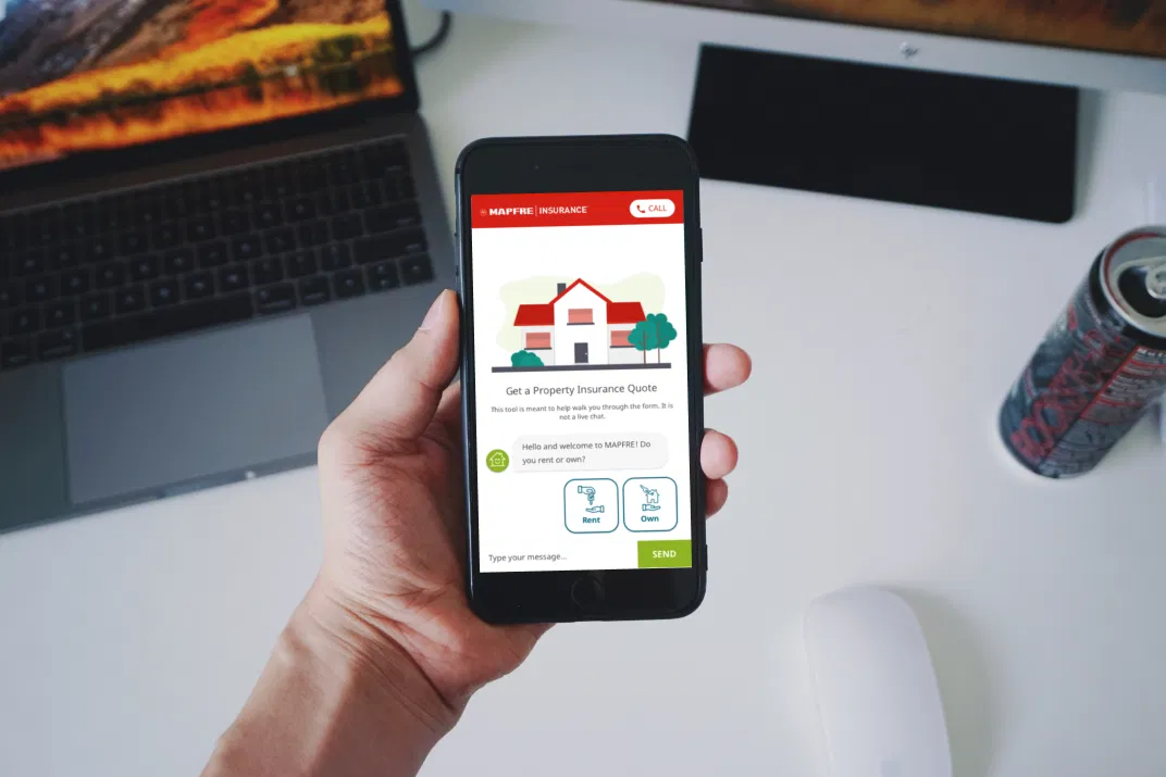
The finished product
As mentioned before, we had no marketing campaign, so all visitors came from links on the company website or from Google search results. Even without marketing, this project was a success. In its first quarter of existence, the form brought in 5 figures of new policy sales revenue.
In late 2020, it was replaced with a new quoting platform.
Here’s a sampling of screens from the first release: