Project goal
Overhaul the information architecture to make ARS easier to navigate and give it a more modern design.
My role
I handled the user interview portion of this project and collaborated with another designer on the visuals and information architecture.
Outcome
Unanimous positive feedback from agents during user interviews. They liked the new UI, and the new information architecture helped them complete their tasks faster.
The Agent Resource Site (ARS) is a portal for MAPFRE’s partner insurance agents that contains the various documents, reporting tools, and manuals they use when working with their customers.
Learning
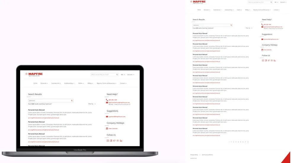
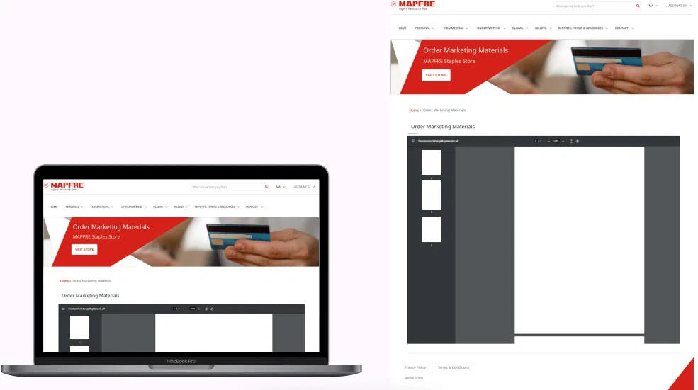
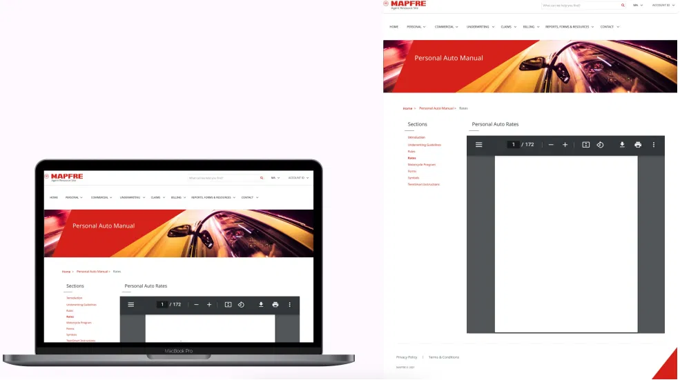
Before starting on the project, I took some time to explore the existing version of ARS. I also spoke with developers, who said that they were going to use WordPress for the new project. They needed several templates for thew new version of ARS, including a design for a homepage, a contact page, a search results page, and several different types of content pages. The intermediate stage of the new ARS would include iFrames within pages to show PDF content, but the ultimate goal was to convert all PDFs to regular HTML pages.
Issues with the legacy version of ARS:
- Navigation menu was too large and too disorganized.
- No search functionality.
- Links behaved unexpectedly.
- Outdated UI design.
- Important content trapped in non-searchable PDFs.
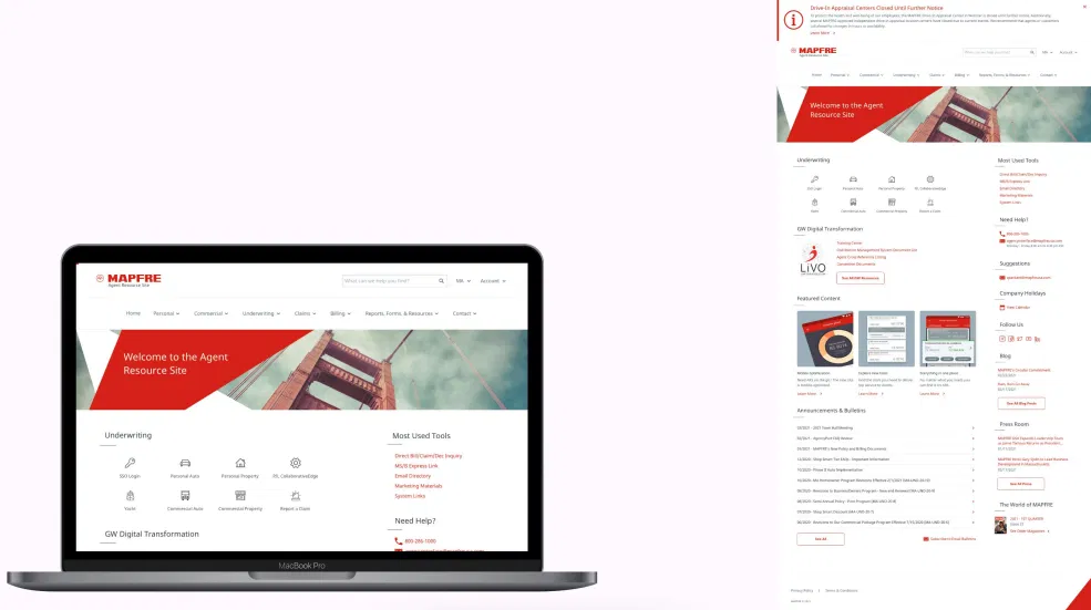
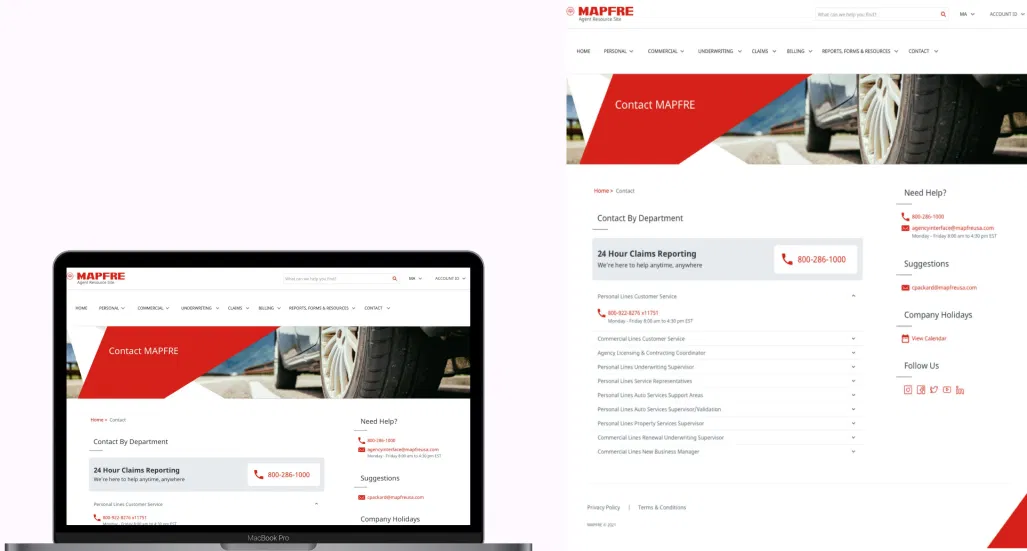
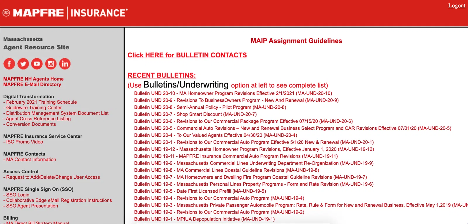
Legacy ARS homepage
ARS was overwhelming and difficult to navigate. The screenshot below shows what users saw upon logging in. It’s hard to see in the screenshot, but the left menu scrolled through hundreds of items categorized seemingly at random. In later user interviews, I would learn that some agents used CTRL+F to find what they needed every time they logged onto the site.
Defining the problem
ARS was difficult to navigate because of its confusing information architecture and lack of search functionality. The average insurance agent is often busy on the phone with customers. Being able to pull up the information they need quickly is essential. ARS failed to meet this need because of its complexity and poor organization.
A successful redesign would reduce the amount of time agents spent attempting to navigate ARS.
Once the design team realized the problems with the legacy ARS, we outlined a plan for the project.
Next steps:
- Define new information architecture.
- Create wireframes for each new page type.
- Write a user interview script to ensure we maximize our time with the agents.
- Create an interactive prototype in Axure for agents to test.
- Test the prototype and adjust as needed.
- Hand off to developers.
Creating new information architecture
The most important part of our redesign was overhauling the information architecture. We needed to take the hundreds of links on the site and put them in no more than 7 categories that made logical sense.
I worked with another designer to brainstorm different ways to split up the information architecture of the site into a manageable number of “buckets” that were intuitive enough to figure out. We went through ARS and made a spreadsheet of every link and its current category. Stakeholders had asked us to drop some outdated links in the redesign, so we also noted when a link was broken or part of the “To Be Removed” list. Once we could clearly see what each link did, we were able to sort them all into a manageable number of main categories to display on the navigation menu.
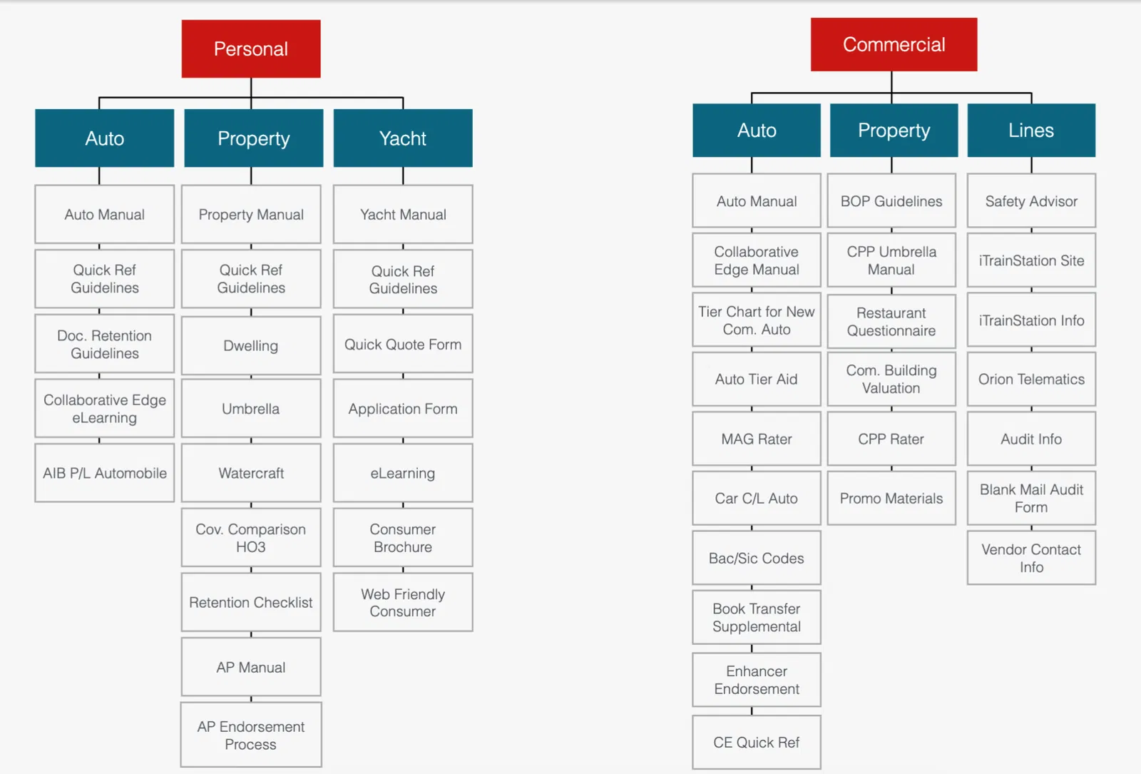
We decided to group the insurance content primarily by type of policy it pertained to (home, property, other).
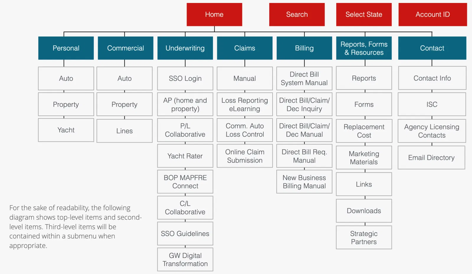
The personal and commercial areas each had their own subsections.
Wireframing and prototyping
I worked with the other designer to make some quick low-fi wireframes for several different page types, but he primarily owned this part of the process. He refined them into higher fidelity versions while I moved onto other tasks– namely, preparing a test plan.
After he finished the wireframes, I polished them and applied MAPFRE styling from the corporate design system. Once this was finished, I created an interactive prototype in Axure that would allow agents to complete the scenarios I laid out for them in my test script.
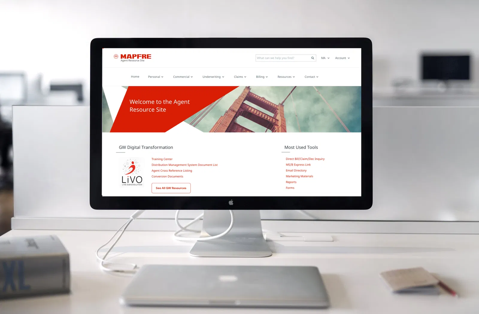
Click on each screenshot to see the page in its full glory. Just to be safe, I redacted some content from the PDF iFrame pages that may have included business-specific information.